questrade's onboarding overhaul
how customer-first design simplified a complex, fragmented onboarding journey.
This case study is work in progress.
my role
Senior Product Designer leading the project.
Led the project from start to finish
I planned the project, aligned stakeholders, and guided our designers, researchers, and writers throughout discovery, solutions, and delivery.

Collaborated across the org
Marketing was very invested in this project as the team responsible for growth numbers. Compliance and legal were also regularly consulted to ensure we were staying compliant while

Designed with developers
I partnered with developers and technical product owners to make sure we aligned on design and development solutions early and often.

the problem
The product is scaling while onboarding numbers are dipping.
1
Our onboarding flows had to scale to support new products
Questrade was adding new banking products that would require onboarding that could to fit each product's unique needs.
2
There was a 10% increase in customers dropping off during signup
More customers were dropping off during onboarding. Teams across the company, especially marketing, were eager to turn things around.

discovery
gaining insight into why more and more customers were abandoning their account applications
1
Customer Experience Surveys
Since we'd been anticipating this project kickoff, the customer experience team had been sending out automated surveys to users who had abandoned their first account application.

Themes

Trouble choosing a product/account

Didn't understand the process
Wanted to test the product
2
User interviews
We set up interviews with 6 of our survey participants. 3 that had trouble choosing and 3 that didn't understand the process. We were able to observe each of them attempting to open their accounts and probe into what they're thinking during the process.

Key takeaways
Trouble choosing a product or account
"What's the difference between self-directed and QuestWealth?"
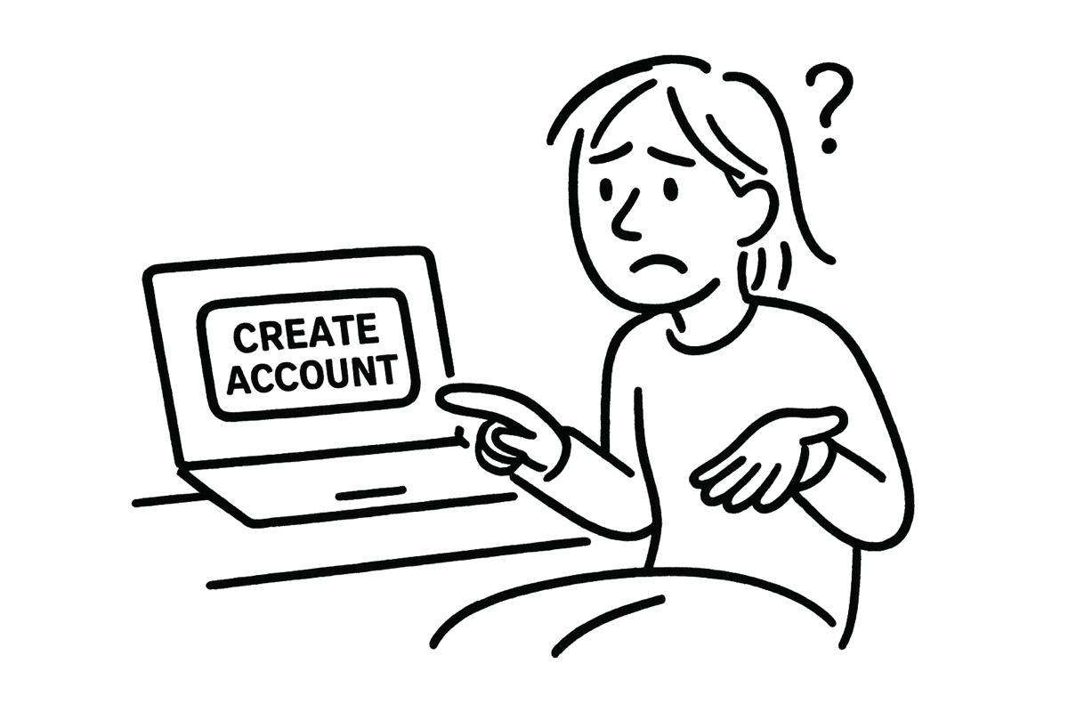
Confused about finishing the process
"I don't know where to go from here"
audit
part 1: product and account selection
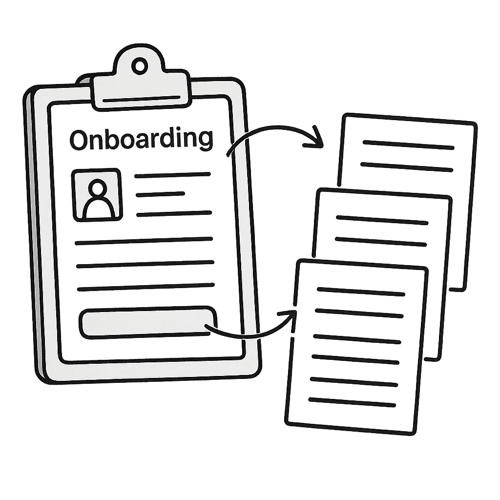
Creating a profile
Users create a profile by independently navigating into each of the 4 cards near the top of the screen.

Too many paths
This screen gives customers access to 37 different pages but almost none of them are helpful during onboarding. Most are features they can’t use yet, a few are sales pitches, and only one is actually useful: the page they’re already on.
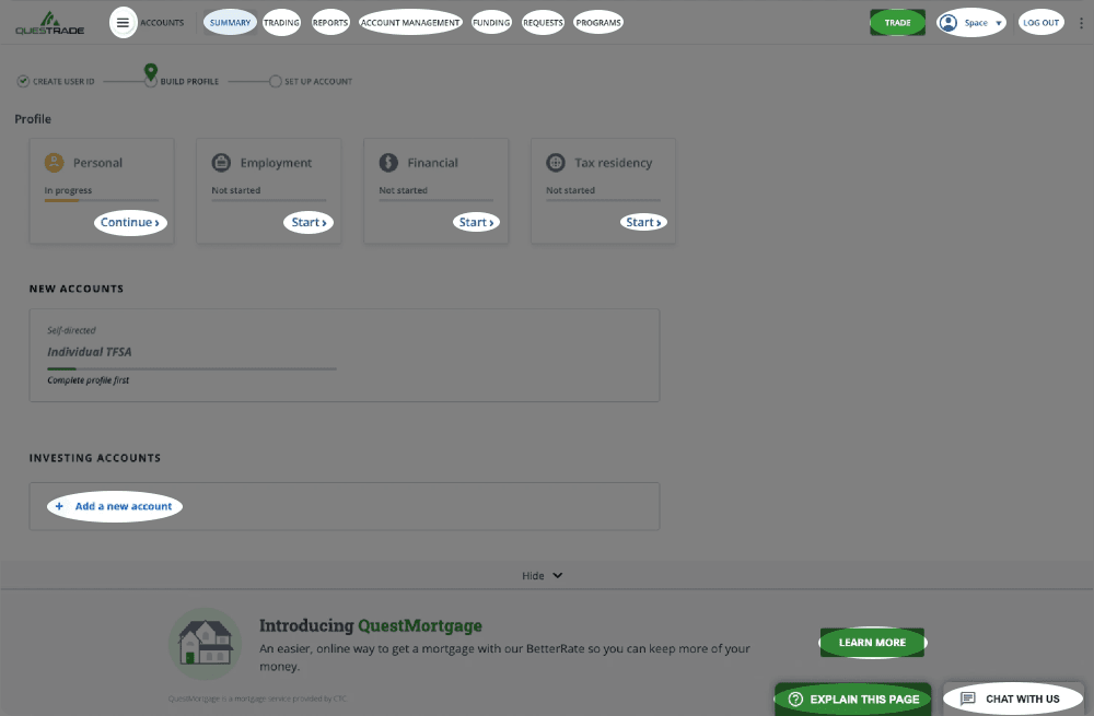

There's no centre stage
Nothing on the screen draws attention to the task, so customers are put to work just to figure out where to start.
1 route with 4 detours
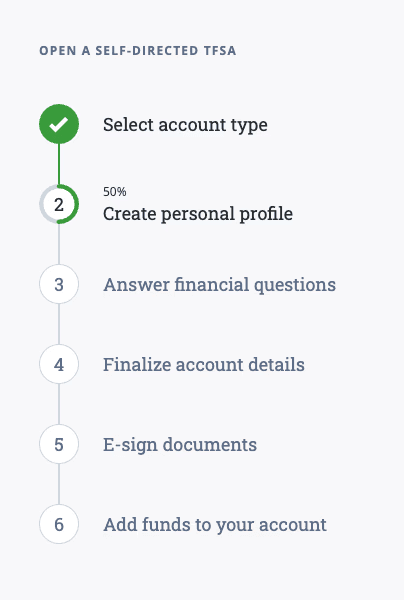
The profile is split across four sections in the top left of the screen. After finishing one, customers are dropped back into the busy main view to find the next. It turns a simple task into a distracting and disjointed experience.

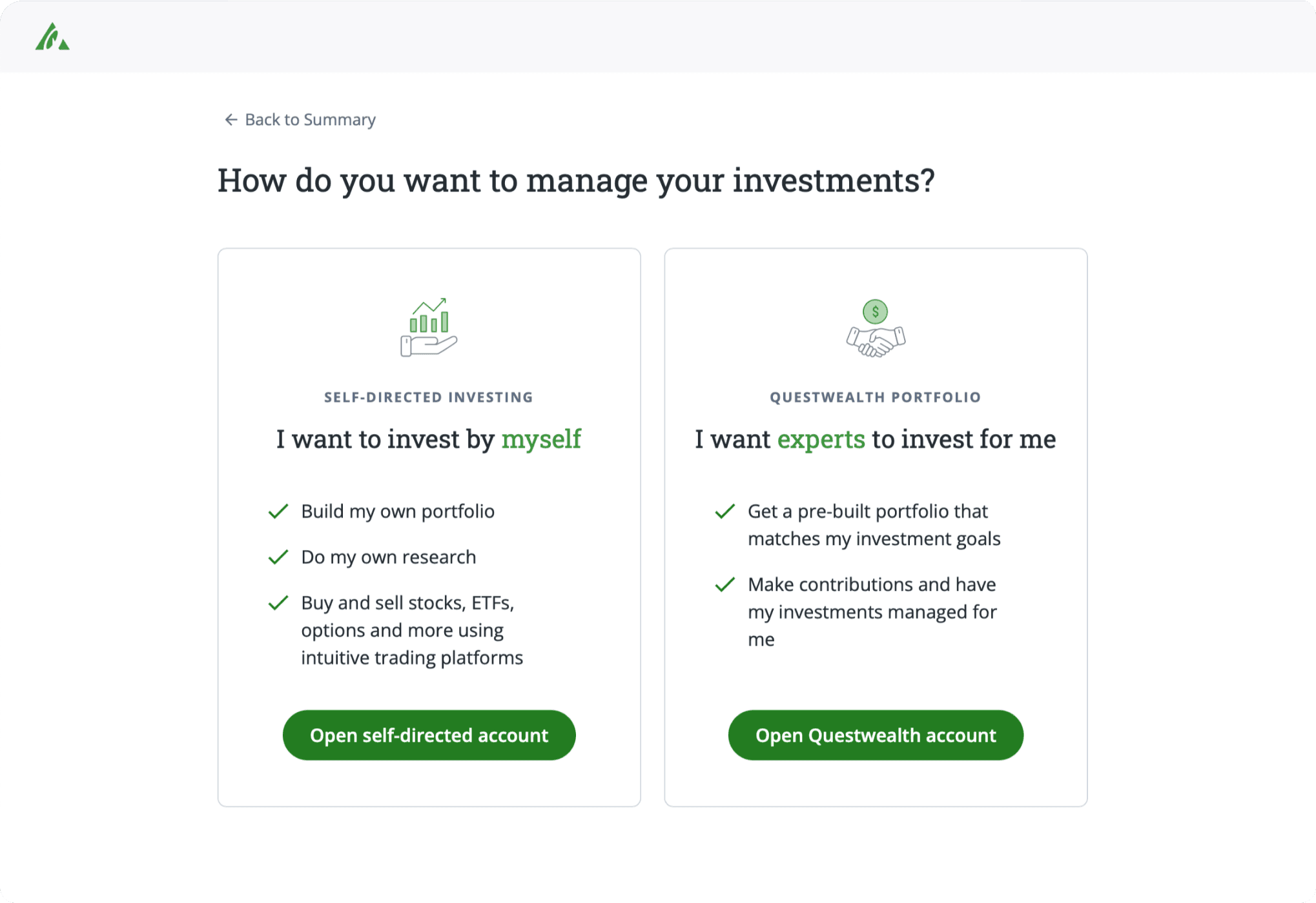
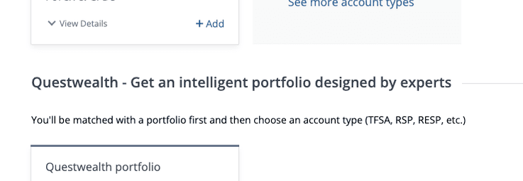
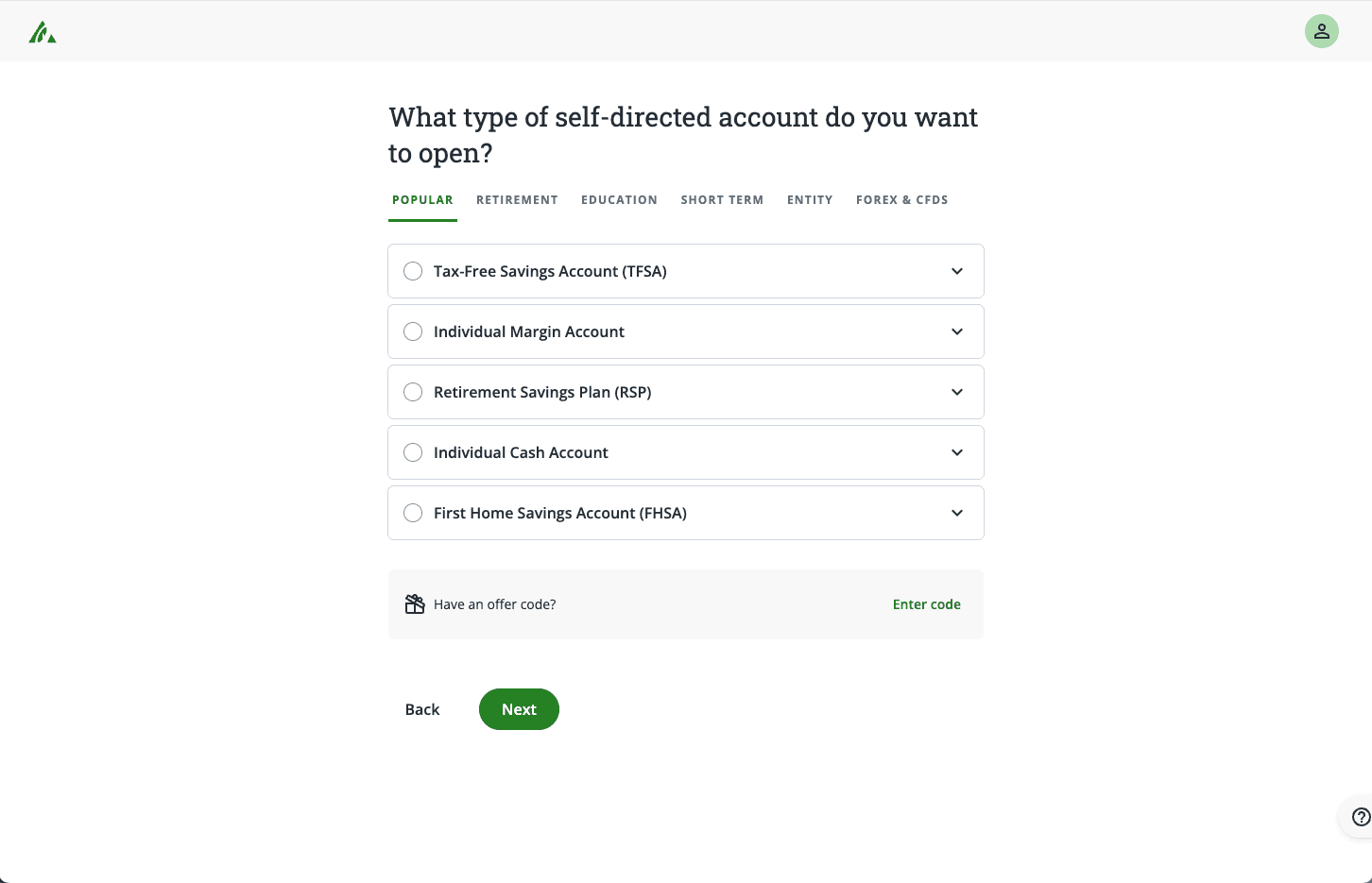
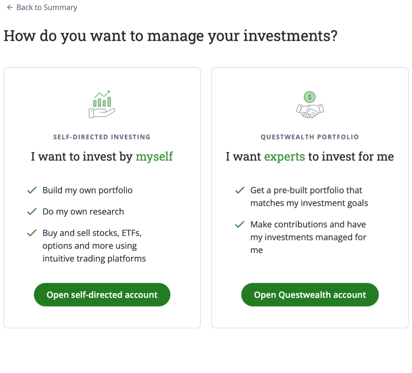
Product & Account Selection
Customers choose which product they want (self-directed or Questwealth Portfolio) as well as which account type they'll associate to the product (Margin, TFSA, RSP, etc.)

Two questions at once
The screen says “Choose an account,” but it’s actually asking two questions at once: Do you want to manage your own investments, or have them managed for you? And what type of account do you want — TFSA, RRSP, or something else? That’s a lot for a beginner to figure out in a single step.

Expectation ≠ reality
With Questwealth Portfolios, users don’t actually choose their account type here. It’s mentioned in small text under a section heading, but most people probably miss it while scanning.
The page fails to set the right expectations because the information just isn’t structured clearly.

Accounts
Product
Relies on ambiguous microcopy
The page leans too heavily on body copy to do the heavy lifting. In a well-designed experience, copy should support the design, not carry it.

principles & ux goals
1
Keep it focused
Keep customers on a focused onboarding journey.

Build a streamlined flow from “open account” to successfully onboarded
Remove distractions and make the few helpful features more easily available
2
Do the heavy lifting
Remove the cognitive load from the customer.

Reduce the complexity of choosing between products and accounts
3
Reciprocate
Give before you take.

Let customers explore and use key moments to invite them to finish signing up.
solutions
Product & Account Selection
Lorem ipsum
Reduce the complexity
Lorem ipsum

Creating a profile
Lorem ipsum

A streamlined flow
Lorem ipsum
Remove distractions
Lorem ipsum

Eventually launched mid-2023
Lorem ipsum
Still unchanged in early 2025
Although I don't have direct data on the success of the redesign, the fact that it has continued to support Questrade's product evolution at scale is a good sign of the success of the project.