Evolving Neo Financial
How good design helped turn a simple fintech product into a full ecosystem ready to take on the big five banks.
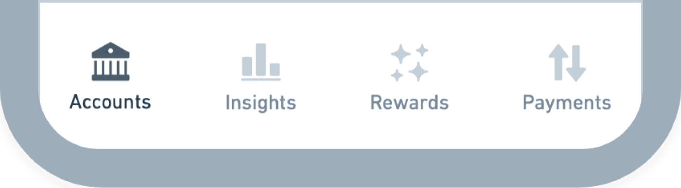
Info. Architecture
UX Strategy
Design System


Sorry, this case study requires a desktop browser 1200px or wider.
Back

the problem
October 2023
Neo's business is evolving faster than the app
The product lineup was growing fast, starting to look more like a big bank. The app’s foundation had to evolve to keep up with this next phase of growth.
New products are breaking the information architecture
“Money” was the first account to grow into a full category of accounts. It marked a key shift: a mini-ecosystem starting to form inside a single-product architecture. This added a new layer of complexity to what used to be a simple experience, and it started to break down the way customers thought about the app.
With even more product categories on the horizon, the architecture would need to evolve to support them properly.


New account features aren't finding a proper home
Each of our products has a unique and growing feature set. Some of these features are critical to both customers and the business. Without a design evolution, important features are ending up buried in submenus.
As we scale our accounts to match the market, we’ll need to thoughtfully design these features into the core experience to encourage engagement.
February 2024

the strategy
Evolving the information architecture
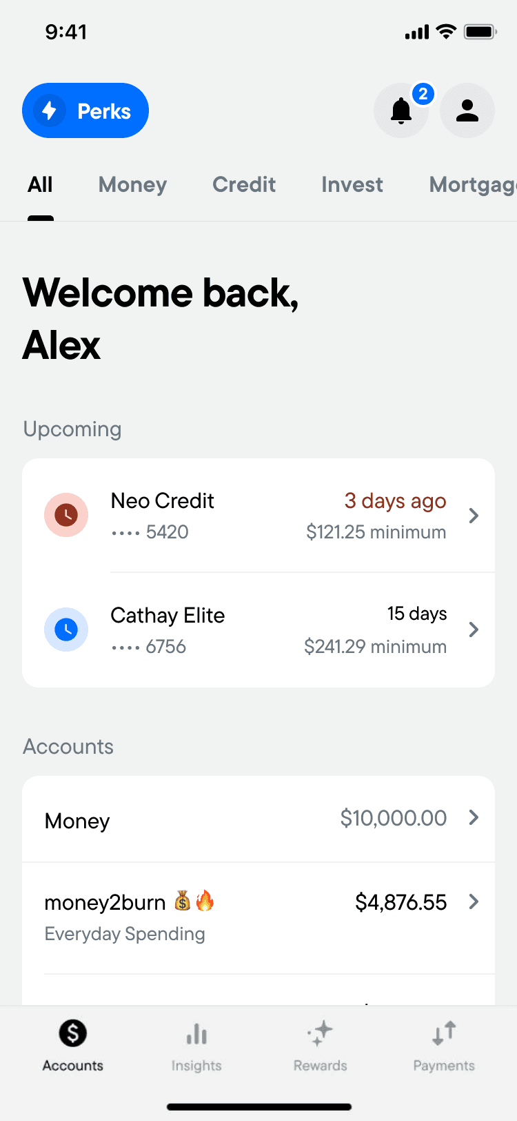
We needed to expand the information architecture to give customers a clearer way to navigate their accounts, perform tasks, and manage their financial goals.
Introducing a category layer
As mentioned, each category of accounts is like a mini ecosystem of its own — a small world that solves a specific financial goal. To support these new surface areas, we needed a new layer of architecture. We needed to give customers room to unpack a larger mental model:
A first layer that captures their overall financial situation
A second layer that focuses on a specific financial category
A third layer for each individual account, where customers can dive deep into management
Neo Credit
HBC
Credit
Neo World Elite
Cathay World Elite
Neo Secured Credit
CREDIT
Everyday Spending
High-interest Savings
GIC
MONEY
Managed Investing
Self-directed trading
Crypto
INVEST
Line of Credit
Instalment plans
Personal loans
LOANS
New
Re-mortgage
Re-finance
MORT.
Home
Auto
Tenant
INSURE
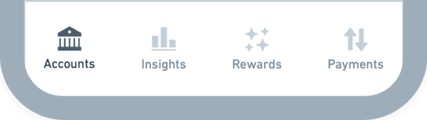
Accounts
The foundation of each account.
Categories
A group representing products of the same type.
Home/All
The entry point of the account experience.
A customer-first system framework
Stepping back from the accounts themselves let us focus on what matters most to customers. Across all accounts, we could see which information and actions made it easier for people to understand their accounts and take quick action.
Designing around these insights helped us stay focused on customer goals, even as the system grew more complex. It also gave us patterns that worked across the whole product line, so no matter what account a customer used, the experience always felt familiar and easy to navigate.
Balance
Spend
Interest rate
Balance
Goal progress
Interest rate
Earned to date
Balance
Realization
Interest rate
Earned to date
Balance
Available
Statement balance
Balance
Available
Statement balance
Balance
Available
Balance
Return %
Earnings
Balance
Return %
Earnings
Watchlist
Balance
Return %
Earnings
Watchlist
Deposit
Transfer
Withdraw
Deposit
Transfer
Withdraw
Auto-Save
Pay balance
Pay balance
Pay balance
Deposit
Auto-Invest
Search
Buy
Deposit
Sell
Search
Buy
Deposit
Sell
Activate card
View card details
Auto-Save
Edit goal
Manage credit limit
View statements
Auto-Pay
Manage credit limit
View statements
Auto-Pay
Manage security fund
Withdraw
Edit goal
Change risk profile
Balance
Goal progress
Interest rate
Earned to date
Balance
Realization
Interest rate
Earned to date
Edit name
View DD details
View statements
View T5 Slips
View agreements
Close account
Edit name
View statements
View T5 Slips
View agreements
Close account
Edit name
View T5 Slips
View agreements
Close account
Balance
Spend
Interest rate
Balance
Goal progress
Interest rate
Earned to date
Balance
Realization
Interest rate
Earned to date
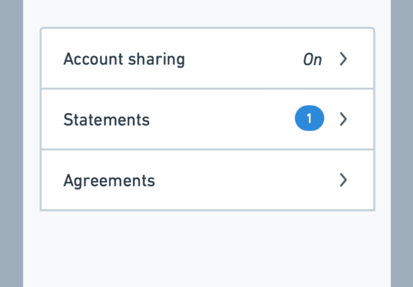
View statements
View tax forms
View agreements
Close account
View statements
View tax forms
View agreements
Close account
View statements
View tax forms
View agreements
Close account
Purchases
Transfers
Predictive deposits
Transfers
Predicted goal end date
Initial deposit
Realization date
Purchases
Subscription
Purchases
Subscription
Purchases
Credit impact
Dividends
Buys
Sells
Dividends
Buys
Sells
Duplicate charges
Declined transactions
Card expiring
KYC review approaching
Balance
Goal progress
Interest rate
Earned to date
Balance
Realization
Interest rate
Earned to date
Overdue payment
Duplicate charges
Declined transactions
Card expiring
KYC review approaching
Overdue payment
Duplicate charges
Declined transactions
Card expiring
KYC review approaching
Duplicate charges
Declined transactions
Card expiring
KYC review approaching
Annual assessment due
Balance near minimum
Annual assessment due
Fraud detected
Overdue KYC lock
Closed
Overdue KYC lock
Closed
Overdue KYC lock
Closed
Delinquent
Fraud detected
Overdue KYC lock
Closed
Delinquent
Fraud detected
Overdue KYC lock
Closed
Fraud detected
Overdue KYC lock
Closed
Overdue KYC lock
Insufficient funds
Closed
Overdue KYC lock
Closed
Overdue KYC lock
Closed
Key performance indicators
Primary actions
Secondary actions
Uncommon actions
Upcoming & Historical
Warning states
Critical states
Money
Everyday
HISA
GIC
Credit
Standard
World
Secured
Invest
Managed
Self-directed
Crypto
System patterns
Redesigning accounts with context
The word “context” comes from Latin and means “to weave together." It gives meaning to information and events. By putting customers’ financial data in context, we can help them understand their own story and take action more easily.
Creating contextual groupings
Before getting into wireframes, we focused on how to present information in a more meaningful way. In a data-heavy environment, keeping things in context makes it easier for customers to find their way.
This approach makes sure the systems and relationships we’re building will fit naturally into the upcoming redesign.
Current balance
Pending total
Posted total
Balance protection
Overlimit protection
Available credit
Credit limit
Credit Utilization %
Request Limit Increase
Reallocate credit (multi)
Payment notice
Pay flow
Auto-pay
Statements
Hardship solutions
Main card
Add card to wallet
Shared cards
Add new card
Pending transactions
Posted transactions
Account number
Agreements
Close account
Total balance
Available balance
On hold
Pending total
Overdraft protection
Monthly spend
Trends
Save w/ HISA
Add funds
Move funds
Auto-save
Statements
Main card
Add card to wallet
Shared cards
Add new card
Pending transactions
Posted transactions
Account number
Direct deposit details
Edit account name
T5 Slips
Agreements
Close account
Total balance
On hold
Goal progress
Interest rate
Lifetime earned
Convert to GIC
Add funds
Move funds
Auto-save
Statements
Posted transactions
Account number
Direct deposit details
Edit account name
T5 Slips
Agreements
Close account
Total balance
On hold
Term progress
Principal
Estimated final balance
Interest rate
Term end date
Initial deposits
Account number
Edit account name
T5 Slips
Agreements
Close account
Credit
Everyday Spending
High–interest Savings
GIC
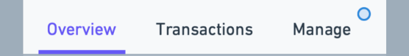
Balances
Health
Move Money
Cards
Transactions
Details
Account type
Translating it to screens and layout
With the contextual groups defined, we explored how they could come to life in the interface.
These four lo-fi concepts show different ways to organize information by keeping related content together, highlighting key actions, and making navigation feel more natural.
Each concept on the right builds directly on the principles we set in the last step.
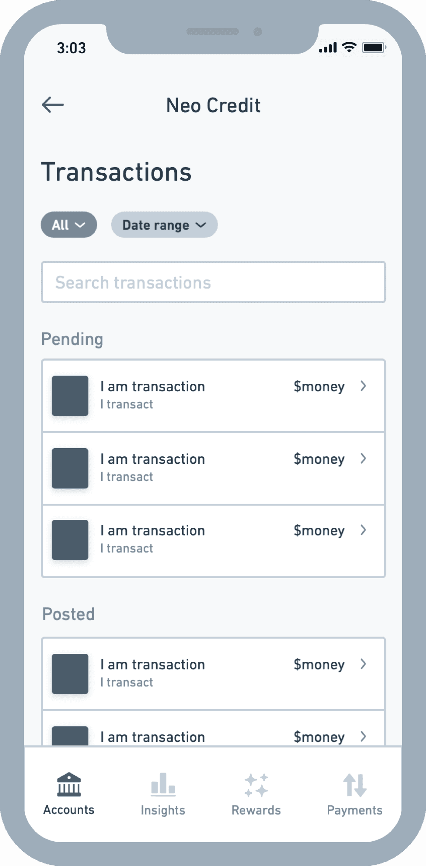
Infinite scroll
Recent Trx
Mid-page tabs
Full page tabs
Retain the infinite scroll
We retain the infinite scroll transaction list and establish a hierarchy vertically on the page.
Development cost
$
$
$
Scalability
Experience
Why this concept?
I feel that when redesigning or adding to an experience, it’s helpful to explore the path of least resistance. It’s not often the best solution, but it can help to highlight the issues with the design and validate the need for a more robust solution.


Recent transactions card
We show a shortlist of recent transactions and move the full scroll transaction list to a dedicated child page.
Development cost
$
$
$
Scalability
Experience
Why this concept?
A number of our transactions use cases are tied to recency, for example, checking for payroll deposits or confirming the last transaction. This approach maintains this ‘quick glance’ ability while offering more flexibility ranking the card in the hierarchy.


Mid-page tabbed sections
We keep a core content section at the top of the page while introducing a tabbed page menu below.
Development cost
$
$
$
Scalability
Experience
Why this concept?
It allows us to keep the current infinite scroll transaction list while positioning less common but important actions nearby. It’s likely to be the least disruptive change as customers start to operate in a more complex page.


Full-page tabbed sections
We introduce a tabbed menu at the top of the page and and keep a core content section in the top ranked tab.
Development cost
$
$
$
Scalability
Experience
Why this concept?
If the mid-page tab menu creates clear primary and secondary content areas, this concept goes a step further to ask what if each content area was to be presented more equally in the architecture.


the examples
Evolving the payments mental model
Managing a single credit card payment is simple. Managing multiple payments each month gets complex quickly.
The credit payment flow benefited from its position in the single-product architecture
The Credit tile sat at the top of the home page, with a dynamic payment notice counting down to the due date. Customers could simply open the app to stay informed.


But that would break in a multi-product world
As we tried to scale this design, the things that mattered most to customers quickly got lost in a busy page. With more lending accounts in play, the design lost its ability to manage payment anxiety.
It showed how important it was to move away from a siloed account model and focus on building systems around these key use cases.

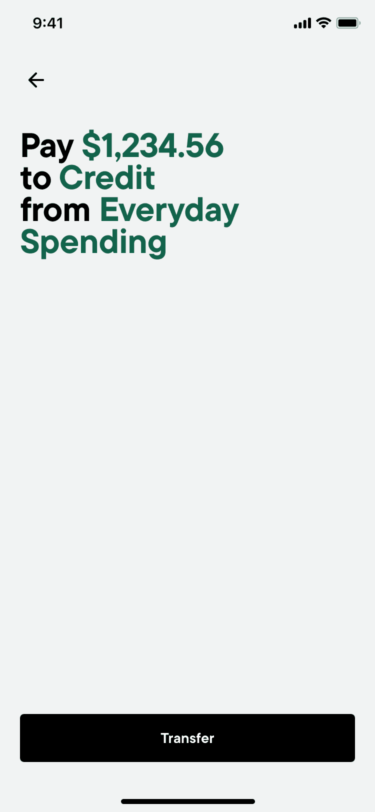
Reducing payment complexity with a system approach
By stepping back from individual accounts and focusing on repayment at a system level, we could build around what matters most to customers: the amount due and the due date.
This gave us the flexibility to design a UI that matches how people actually think — in this case, a simple list of upcoming payments that mirrors how they experience time.
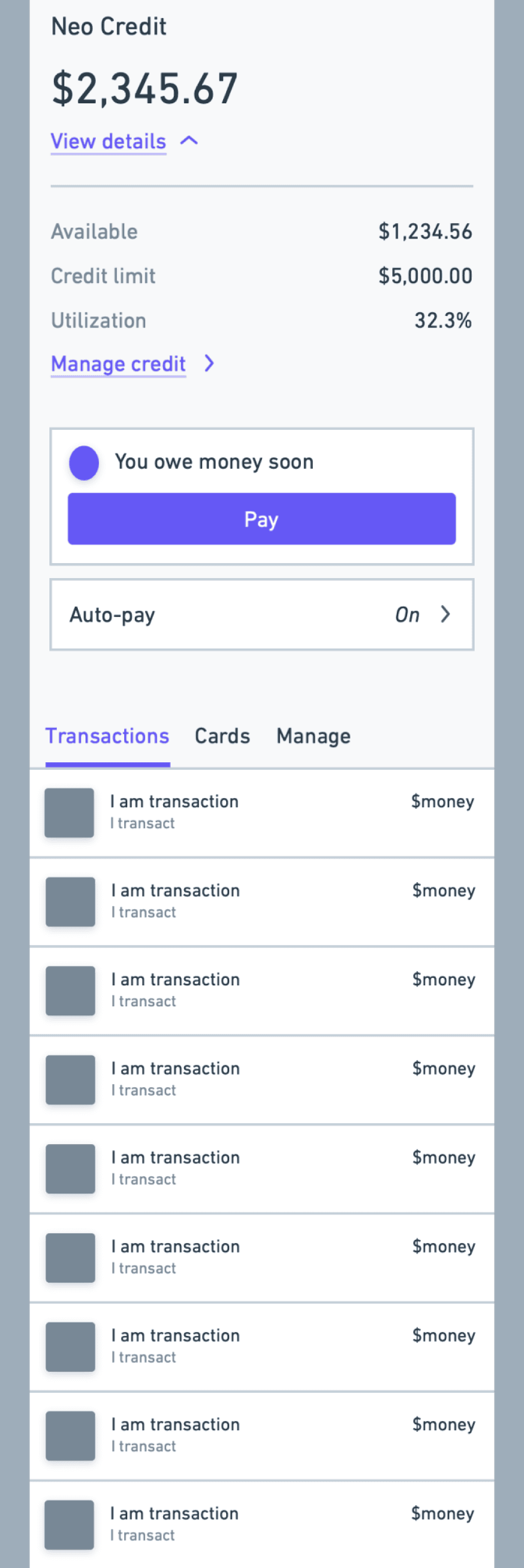
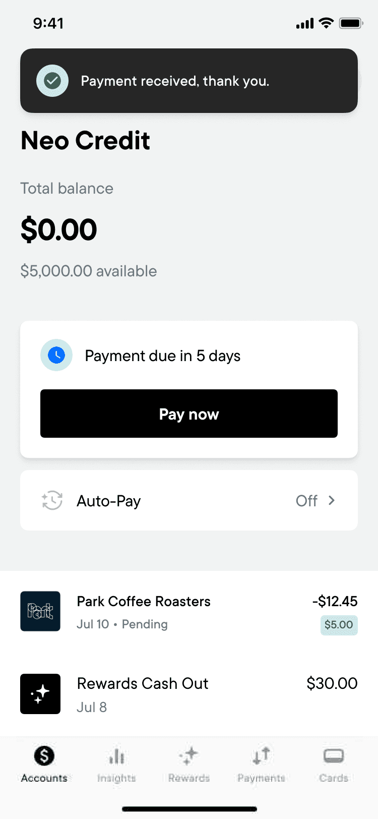
Raising credit limit awareness
Bringing credit utilization into the core story of a credit account drove a lasting increase in engagement.
Credit limit management was hidden and disconnected
The feature was launched quickly and ended up disconnected from key information. Even customers who had already decided to change their credit limit had to hunt for it, because it wasn’t placed in the right context inside the app.


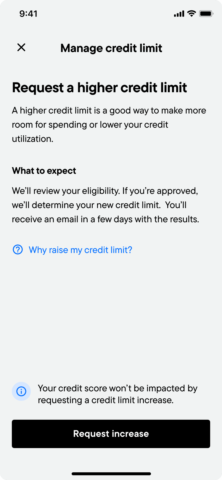
Making account health visible and actionable
Technically, the change was simple. Using our context framework, we grouped a few metrics and an action, and moved them closer to the surface.
But the substance of the change was significant. Customers could now keep the health of their accounts front of mind. It also opened the door for more tailored messaging that could be acted on immediately.

Requests for more credit increase 500%
Our week-over-week analysis showed that credit limit increase requests doubled after launch, and eventually climbed to five times the old rate once the updates were fully live.
It was an early sign that putting customer data in context could drive a real jump in engagement. It also helped build the momentum we needed to get stakeholder buy-in for the full redesign of our account pages.
Requests for more credit (WoW)
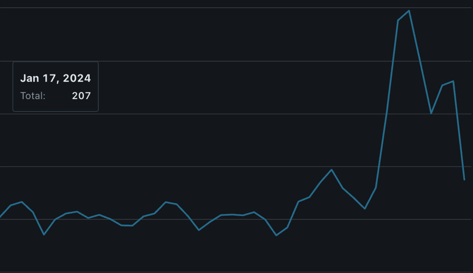
App
launch
Web
launch

App
Launch
Web

the updates
Building a system that could scale
What we were building needed to scale into an uncertain future and support products we hadn't dreamt of yet. To ensure these patterns and principles could continue to evolve, we had to clearly share our design philosophy with the wider team.
Defining page-level design principles
Each page was structured to reflect the in-context groupings we set out to create. We needed to clearly define and explain these page principles so future designers could stay aligned and build on them.
For example, every account details page follows a common template shaped by these principles, making it easier for others to keep scaling the app as products are added and evolve.
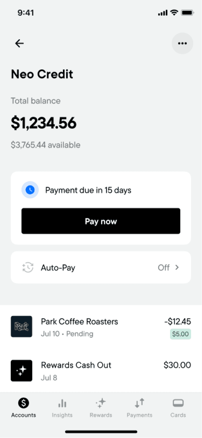
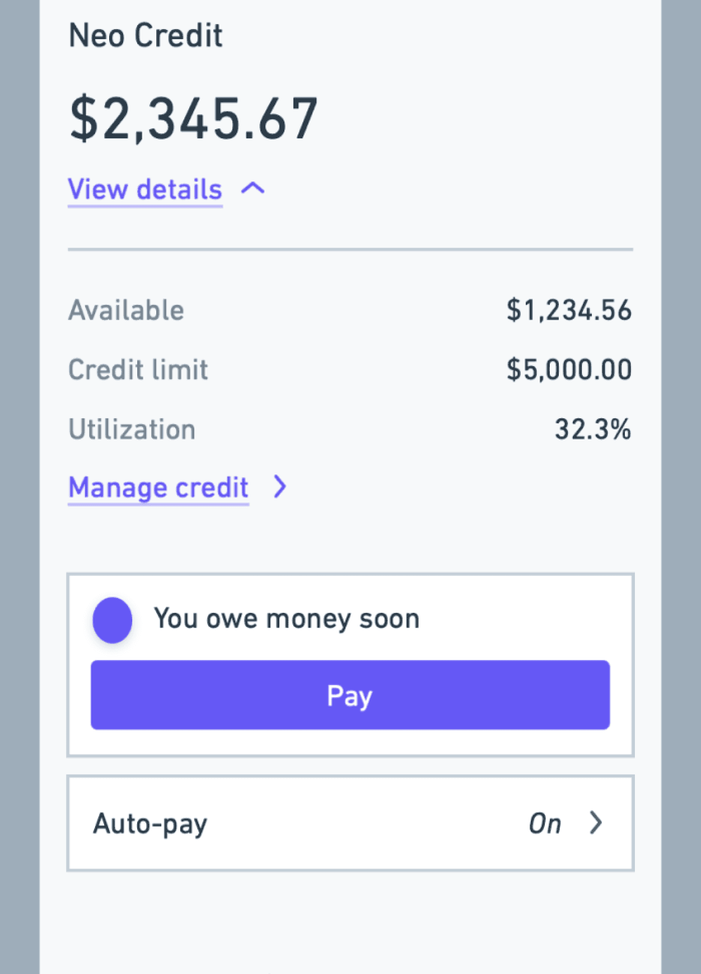
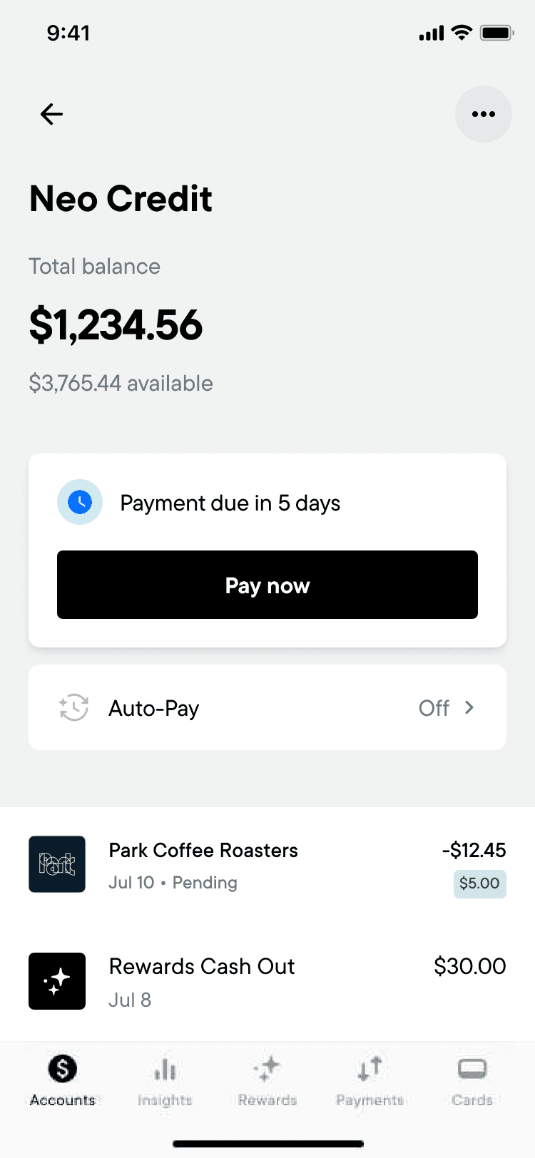
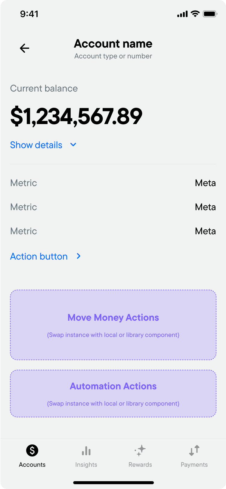
Account Details breakdown
Total balance
$123,456.789
Show details
9:41
Rainy Day Dream Vault
High-Interest Savings
Header and balance
The header & balance section helps customers quickly understand their account balance and makes it easy to dive into more complicated details when needed.
To make sure of this, we:
provide customers with the actionable account balance at the surface level.
don’t unnecessary totals at the surface level
show only account balance information in the accordion to avoid confusion.
If the data doesn't contribute to helping the customer understand how their balance is made up, it likely belongs in a different section of the page.
Components used
Secondary header
Balances accordian
Available
$3,456.78
Credit limit
$5,000.00
Utilization
24.69%
Manage credit
Health Metrics
This health metrics section houses the metrics that help customers understand the health and outlook of their account.
Typically each account type will have a specific intention. For example, a savings account is intended for saving money. Metrics like the interest rate and the interest earned to date are metrics that help customers understand how the account is performing toward that savings goal.
Often times, features and functionality will be closely tied to the account’s health metrics. The action button allows us to make these actions available directly in context to the metrics that help inform their decisions.
Components used
Health Metrics
Payment due in 15 days
Pay now
Auto-Save
Off
Move Money
Move money section facilitates moving money in, out, and around the Neo ecosystem in context to the account that’s currently being viewed.
We should ensure that users have full control and visibility over their financial movements with the ability to efficiently manage it.
Typically there are 1 or 2 move money actions that are used significantly more than the others, and we'll want to prioritize them in the experience. For example, in the Everyday Spending account, we prioritize the transferring between accounts and sending money.
Components used
Secondary header
Balances accordian
Embedding design thinking into templates
Page templates bake our design thinking right into the system. With a mix of properties and slot components, designers can quickly build pages that follow system patterns while still having full control over the content inside.


app
web

the impact
Early results and adoption
After launch, we started to see early signals that the new system was making an impact.
Customers are trusting Neo with more of their financial goals
There's been a 16% increase in customers actively using more than one account.
Customers with > 1 account (%)
Launch!
50
40
30
20
10
0
Customers are unlocking more accounts and features
The number of customers using at least one key feature — like Balance Protection — has increased from 5% to 9%.
Customers using a core feature (%)
Launch!
50
40
30
20
10
0
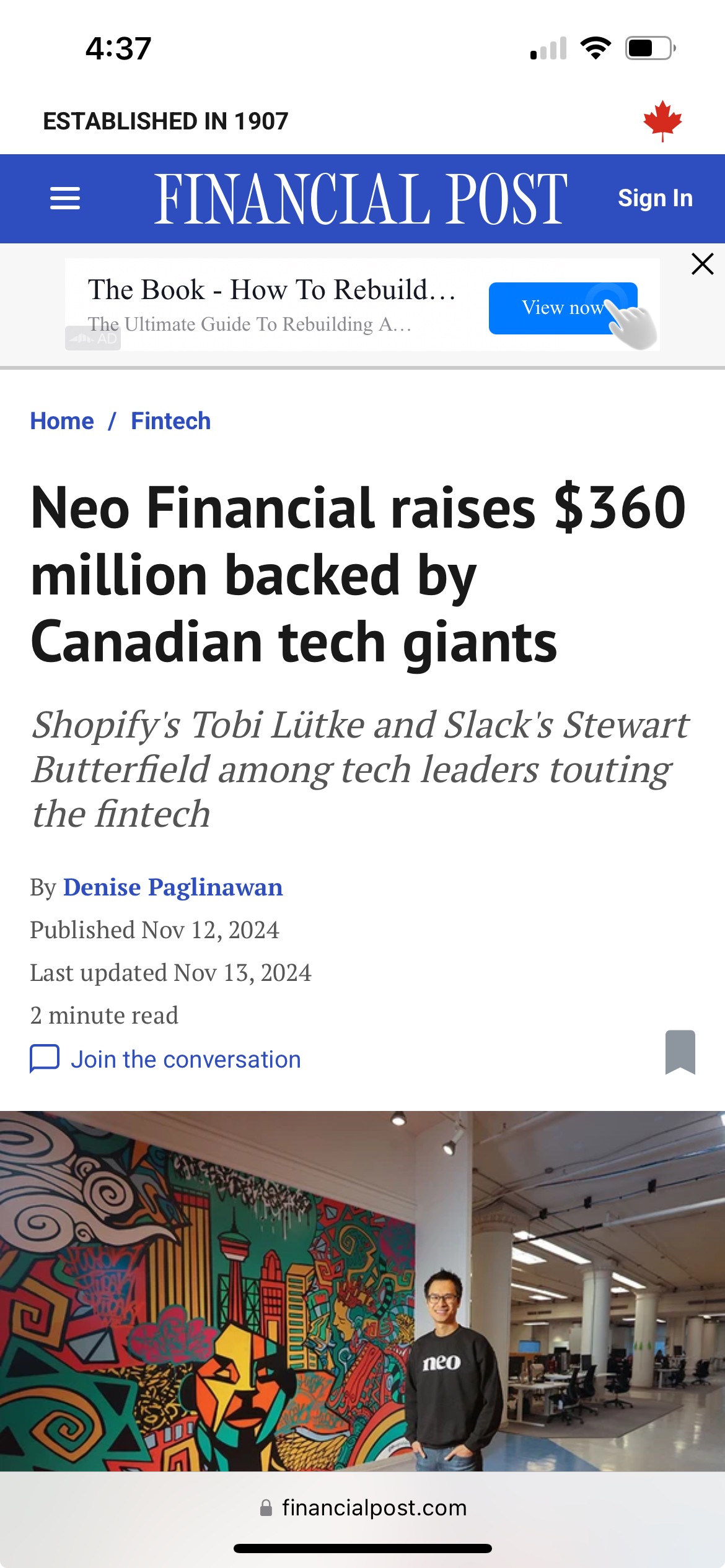
Neo raises $360 million in Series D funding
About three months after launch, Neo closed its largest funding round yet, raising $360 million in Series D financing.
It was a strong signal that investors believed Neo had built the foundation needed for its next stage of growth.